Album artwork plays a crucial role in music marketing, serving as a visual representation of an artist’s sound and style. Different musical genres often have distinct visual trends that resonate with their target audiences. This article explores the album art trends across various genres, examining what works and why these elements are effective.
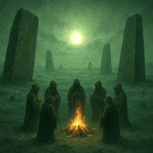
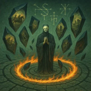
Rock and Metal
What Works:
– Dark, intense imagery
– Bold typography
– Symbolic or occult elements
– Intricate illustrations
Why:
Rock and metal album covers often reflect the music’s intensity and rebellious nature. Dark imagery and bold typography capture attention and convey the genre’s energy. Symbolic elements can represent lyrics or themes, while intricate illustrations showcase artistic depth, appealing to fans who appreciate complexity in both music and visuals.
Hip-Hop and Rap
What Works:
– Artist portraits
– Urban landscapes
– Luxury items and status symbols
– Bold, graffiti-inspired typography
Why:
Hip-hop album art frequently focuses on the artist’s image, reinforcing personal branding. Urban landscapes connect with the genre’s roots, while luxury items represent aspirational themes common in rap lyrics. Graffiti-inspired typography pays homage to hip-hop culture and street art, creating an authentic feel.
Electronic and Dance Music
What Works:
– Abstract designs
– Vibrant colors
– Geometric patterns
– Futuristic elements
Why:
Electronic music album art often mirrors the genre’s innovative and forward-thinking nature. Abstract designs and geometric patterns reflect the music’s synthetic and rhythmic qualities. Vibrant colors capture the energy of dance floors, while futuristic elements align with the genre’s technological aspects.
Pop
What Works:
– Glossy artist photos
– Minimalist designs
– Pastel or neon color palettes
– Playful, eye-catching imagery
Why:
Pop album covers frequently showcase the artist, capitalizing on their public image and appeal. Minimalist designs ensure the artwork is easily recognizable even at small sizes on streaming platforms. Bright, fun color palettes attract attention and reflect the genre’s upbeat nature.
Country
What Works:
– Rural landscapes
– Americana imagery
– Warm, earthy color palettes
– Traditional typography
Why:
Country album art often incorporates elements that resonate with the genre’s themes of rural life, patriotism, and tradition. Landscapes and Americana imagery connect with the music’s lyrical content, while warm color palettes evoke a sense of nostalgia and comfort.
Jazz
What Works:
– Vintage-inspired designs
– Abstract representations of instruments
– Sophisticated color schemes
– Elegant typography
Why:
Jazz album covers often pay homage to the genre’s rich history while also embracing modernity. Vintage-inspired designs connect with the genre’s roots, while abstract elements reflect its improvisational nature. Sophisticated color schemes and elegant typography convey the music’s complexity and refinement.
Classical
What Works:
– Minimalist designs
– Fine art reproductions
– Elegant, serif typography
– Muted color palettes
Why:
Classical album art tends to focus on simplicity and elegance, reflecting the genre’s sophistication. Minimalist designs allow the music to take center stage, while fine art reproductions connect the auditory experience with visual artistry. Muted color palettes and serif typography convey a sense of timelessness and tradition.
Indie and Alternative
What Works:
– Quirky, unconventional imagery
– Hand-drawn elements
– Retro-inspired designs
– Ironic or subversive concepts
Why:
Indie and alternative album art often aims to stand out through unconventional choices. Quirky imagery and hand-drawn elements reflect the genre’s DIY ethos and personal expression. Retro-inspired designs appeal to the genre’s often nostalgic undertones, while ironic concepts showcase intellectual depth and humor.
World Music
What Works:
– Cultural symbols and patterns
– Traditional art styles
– Rich, earthy color palettes
– Authentic imagery
Why:
World music album covers often celebrate cultural diversity and heritage. Incorporating traditional art styles and cultural symbols helps convey the music’s origins and authenticity. Rich color palettes evoke the vibrancy of different cultures, while authentic imagery connects listeners to the music’s roots.
Conclusion
The effectiveness of genre-specific album art trends lies in their ability to visually communicate the essence of the music and connect with the target audience’s expectations and values. Successful album covers not only represent the sound but also tap into the cultural and emotional associations of the genre.
However, it’s important to note that while these trends can serve as useful guidelines, the most memorable album covers often come from artists who aren’t afraid to subvert expectations and push creative boundaries. The key is to understand the genre’s visual language and then find innovative ways to speak it.
As the music industry continues to evolve, particularly with the rise of digital streaming, album art must adapt to remain impactful even at smaller sizes. This has led to a general trend towards bolder, simpler designs across all genres. Nonetheless, the power of a well-crafted album cover to capture attention, convey emotion, and encapsulate an artist’s vision remains as crucial as ever in the visual-centric world of music marketing.


