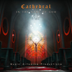
Your music cover art is your first impression. It’s your handshake, your introduction, the visual embodiment of your sound. Yet, amidst the excitement of release, even the most seasoned artists can fall prey to common cover art mistakes that dampen that first spark.
In this article, we’re diving into the ten most prevalent cover art blunders and, more importantly, how you can skillfully sidestep them to ensure your music radiates the vibrant vibes it deserves.
1. The Blurred Vision
Pixelated images, fuzzy text, or an overall lack of clarity can make your cover art look unprofessional and unappealing. Remember, it’s not just about looking good on your screen; it needs to translate across various platforms, from streaming services to social media thumbnails.
How to Avoid:
- High-Resolution is Key: Start with high-quality images and graphics.
- Mind the Dimensions: Different platforms have different size requirements. Design with flexibility in mind.
- Test, Test, Test: View your artwork at various sizes to ensure it remains sharp and clear.
2. The Generic Template Trap
Using generic templates or overused imagery can make your cover art blend into the background. It’s essential to stand out in a sea of releases.
How to Avoid:
- Embrace Originality: Invest in custom artwork that reflects your unique sound and brand.
- Think Concept: Consider the story behind your music and translate that visually.
- Collaborate: Partner with a talented designer or visual artist to bring your vision to life.
3. The Text Overload
Too much text on your cover art can be overwhelming and distracting. It competes with the visuals and dilutes the impact.
How to Avoid:
- Less is More: Keep the text concise and impactful.
- Prioritize: Focus on the essentials like artist name and album title.
- Choose Readable Fonts: Opt for clear, easy-to-read fonts that complement the overall design.
4. The Color Chaos
Clashing colors or an overly busy palette can create visual confusion and detract from the artwork’s appeal.
How to Avoid:
- Color Theory Matters: Familiarize yourself with basic color theory principles or work with a designer who understands them.
- Limit Your Palette: Choose a few key colors that complement each other and your music’s vibe.
- Consider Contrast: Ensure sufficient contrast between the background and foreground elements for readability and visual impact.
5. The Ignored Genre Cues
Your cover art should visually align with your music’s genre. A disconnect here can confuse potential listeners.
How to Avoid:
- Research: Study cover art trends within your genre for inspiration and guidance.
- Reflect Your Sound: Use visuals that evoke the emotions and energy of your music.
- Be Authentic: While drawing inspiration from trends is helpful, ensure your artwork remains true to your unique artistic expression.
6. The DIY Disaster
Unless you’re a skilled graphic designer, attempting complex cover art yourself can lead to a less-than-professional result.
How to Avoid:
- Know Your Limits: If design isn’t your forte, consider collaborating with a professional.
- Utilize Resources: If you’re on a budget, explore user-friendly design tools or templates that offer a degree of customization.
- Seek Feedback: Share your drafts with trusted individuals for honest critiques and suggestions for improvement.
7. The Copyright Infringement
Using images or fonts without proper licensing can land you in legal trouble. Respect intellectual property rights.
How to Avoid:
- Use Royalty-Free Resources: Source images and fonts from reputable websites that offer royalty-free or Creative Commons licenses.
- Obtain Permissions: If you want to use a specific copyrighted image, seek permission from the copyright holder.
- Commission Original Artwork: This ensures you own the rights and avoid any potential copyright issues.
8. The Missing Emotional Connection
Your cover art should evoke emotions and resonate with your audience. A purely functional design lacks that spark.
How to Avoid:
- Tell a Story: Consider the narrative behind your music and translate that visually.
- Evoke Feelings: Choose imagery and colors that align with the emotions you want to convey.
- Consider Your Audience: Think about who your music is for and what visuals would appeal to them.
9. The “Me Too” Moment
Copying another artist’s cover art is not only unoriginal but can also damage your reputation. Strive for authenticity.
How to Avoid:
- Find Inspiration, Not Imitation: Draw inspiration from various sources, but create something uniquely yours.
- Develop Your Brand: Cultivate a consistent visual identity that sets you apart.
- Celebrate Your Individuality: Embrace what makes you and your music unique and let that shine through in your artwork.
10. The Last-Minute Rush
Rushing your cover art design can lead to oversights and missed opportunities. Give it the time and attention it deserves.
How to Avoid:
- Plan Ahead: Start conceptualizing your cover art early in the music creation process.
- Allocate Sufficient Time: Factor in design and revision time in your release schedule.
- Don’t Be Afraid to Iterate: Allow for multiple rounds of feedback and refinement to achieve the best possible result.
Creating compelling cover art is an art in itself. By avoiding these common mistakes and investing time and thought into the process, you’ll ensure your music makes a vibrant first impression that resonates with your audience and sets the stage for a memorable listening experience.
Remember: Your cover art is an extension of your music. Treat it with the same care and creativity you pour into your songs, and watch your vibrant vibes shine through!
For further guidance on creating stunning cover art, check out this helpful resource: How to Make Album Cover Art


